


Nearly five years into the relationship with Jack in the Box—and three years after we tackled the re-design of Jack’s digital home—it was time to give their website a comprehensive renovation. The brand strategy had shifted from the fun and irreverent Jack to a 'Get it Now' faster messaging platform. And so the site followed suit. With a focus on adaptability and responsiveness, the new site is a blend of a sharp digital aesthetic all wrapped into an extremely light and easily accessible framework. Everything within the site is accessible by no more than one or two clicks. Deals and special offers are sprinkled everywhere. And it’s all built in a modular, adaptive system based on screen size and device. It’s a substantial upgrade matched only by the continually craveable Jack in the Box Mini Churros.
Jack in the Box wanted to modernize their web site to reflect their younger millennial based audience and find unique ways to showcase the food and lifestyle imagery.
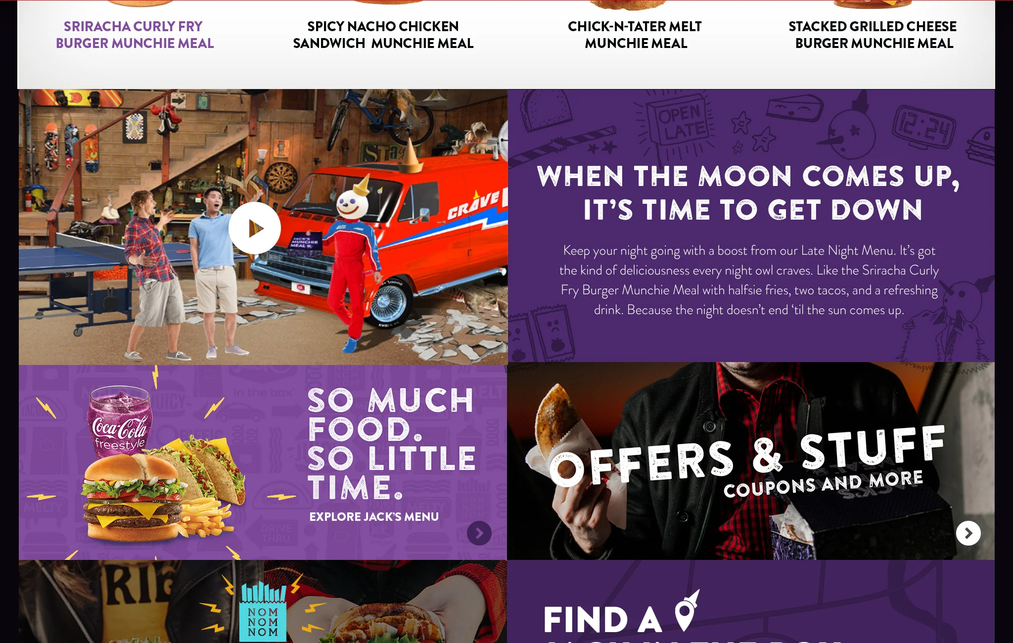
Another interesting side challenge was to reduce attention around Jack, the fun loving iconic CEO character. This meant the brand was shifting in some way but in which way was not clear, nonetheless a new site was needed. This spelled out opportunity to influence the brand through the site redesign.
Key Performance Indicators:
1. Email & MMS Subscriptions
2. Find a deal / coupon
3. Convert to a sale (drive to Jack location)
4. Surface limited time offers (specialty products)
Jack in the Box isn’t fast food. It’s now food. It’s what we want, whenever we want it. The site should reflect an in-the-moment lifestyle. This audience utilizes a variety of sophisticated apps and platforms and is accustomed to several emerging interaction models such as scroll-to-reveal navigation, overlays and layers, gesture-based interfaces and the like. The new site framework should take advantage of these models to create a simple, intuitive, modern experience no matter the device but especially mobile first.
Guide Post 1: Design For Everything
87% of millennials use 2–3 different tech devices every day. It’s a non-linear world and every piece of our site needs to meet the expectations of our fans.
Guide Post 2: Food First (aka Food Porn)
In order to make the audience's mouth water into an uncontrollable craving, the food must be front and center in the most delicious way possible.
Guide Post 3: Show Don't Tell
Modern users require very little way-finding or setup to find what they need. Make it simple, straight forward and no more than a few clicks to achieve the desired user task.
Guide Post 4: Jack Gets in the back
While we need to be careful about "removing the fun", we can find ways to diminish Jack's presence and voice across the site as it evolves.
Considering the brand was in flux transitioning from the fun irreverent Jack to a more "Food Now' focus there was an opportunity to refresh the brand. A series of style tiles were created to explore new visual possibilities.
Depending on the time of day the site automatically repositions featured limited time products (LTOs) via the CMS to reinforce what’s crave-able at that time/meal.